Everyone has childhood memories of the films produced by Warner Brothers, Universal Pictures, Columbia Pictures and Walt Disney Studios.
For our data visualization, we chose to compare the number of films produced per year by these four major cinema titans. The necessary data was provided by The Numbers, a site that quantifies various pieces of cinematic information, such as movies, production dates and actors. Initially, we began our analysis from the inception of each of the companies in the early 1940’s. However, all four produced very few films until 1977, prompting us to begin our data set at that point in time.
Here we’ll show the process for visualizing this data:
- Manually enter the data into a blank Excel or Google spreadsheet with columns ‘A’ through ‘E’: Date, Warner Brothers, Universal Pictures, Columbia Pictures and Walt Disney Studios tracing years 1977 – 2017. In our case we used Google Sheets, but if using Excel, it is recommended to save the file format as ‘Comma Separated Values’ (.csv) so that it is compatible with all software.
- Highlight the dataset in the Google Sheets document, open the “Insert” drop-down menu, select “Chart” under “Chart Type” scroll down to “Stacked Column Chart.” In selecting a chart type, we aimed to communicate multiple aspects of our data set simultaneously while still being visually intuitive.

The stacked column chart lent itself to our purposes in these regards, showing a) each company’s yearly release numbers, b) total of movies per year, and c) breakdown of how the numbers compared.
The movies released per year from each of the four companies. Click the image for a more detailed view.
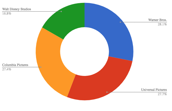
- Following the first visualization, there may be more information to be extracted from a data set. In some cases, the new information can provide an analysis from a wider perspective as well. Here, one can look at the total amount of movies produced by each company over 40 years, visualizing this data to compare the overall success (at least in terms of content creation) of each company. An example being the “doughnut style” pie chart used here. Highlight the data, click “Insert” and select “Chart” you will want to select “doughnut style” pie chart.


The total movies released by the production companies over the forty year period. Click the image for a more detailed view.
- By following the above steps, we arrived at both a micro and macro visualization of the competition between four of the most prolific movie production companies of the period. This inspired the title, Clash of the Titans, itself taken from the 1981 and 2010 Warner Bros. films.
Film production began a sharp upward trend starting in the 1990’s. The obvious conclusion is that movies are cheaper and can be produced in greater numbers, but film budgets, especially for summer blockbusters, have never been higher. So what is behind the boom in the film industry?