Click on this image to visit the interactive Tableau map online.
When the City of Boston started releasing annual student housing reports in 2015, it opened new opportunities to report on housing in the city. A lot of the data in their reports requires further investigation, clarification, and cleaning. But considering the small amount of data that can be used without that work, we chose to find the answers to two specific questions:
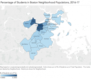
- Which neighborhood populations have the highest percentage of students?
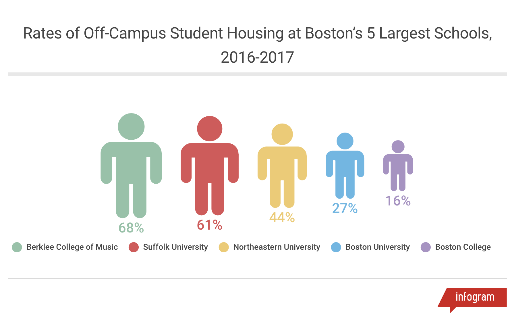
- For the five colleges with the largest student populations in Boston: how many full-time undergraduate students live off-campus?
The data for both graphics came from the City of Boston’s 2016-17 Student Housing Trends report, and the total neighborhood populations in our map visualization were taken from the American Community Survey’s (ACS) 2016 Boston population estimates. The data was cleaned, analyzed and organized using Excel. The map visualization was made with Tableau, and the college comparison charts were made with Infogram.
How to create Boston student housing datasets:
Most general information about student housing is included in the mayor’s annual report on student housing trends. Out of last year’s 22-page report, though, only some of this information is relevant. For these practice data and visualizations, we are only interested in student populations in each neighborhood. and the number of full-time undergraduate students living off-campus for the largest universities in the city. These data can be found on the following charts and pages:
- Table A2: Off-Campus (Private-Housing) Students by Neighborhood (pg. 22).
- Table 5: Percentage of Full-Time Undergraduates Housed by School (pg. 8).
Getting the data you need for these visualizations can be complicated. If you want to see how we gathered, cleaned, and analyzed our data, click here. If not, let’s pretend you’re already working with our clean student housing datasets (Neighborhood Housing and Off-Campus Students) and you’re ready to visualize.
How to visualize Boston student housing data in each neighborhood:
Congratulations for getting through all of that data scrubbing! It was hard work, but you’re here now and we don’t need to dwell on your remarkable accomplishment. Let’s visualize.
Step 1
For the initial mapping visualization, use Tableau. Tableau needs your data in Excel format, so download the Google Sheet linked above for “Neighborhood Housing” as XLS files. Once that’s done, open up Tableau. On the left side of the homepage, you’ll find a blue navigation bar, titled “Connect.” Under the “To a File” category, select “Excel” and import the dataset you just downloaded.
Step 2
Connecting to that file will bring you to a “Data Source” tab (labeled at the bottom left), which allows you to look over your data and make any necessary adjustments. We want the map to recognize the geographic outline of each neighborhood based on the assigned ZIP Code. This will allow us to map geographic areas by ZIP Code, but label them with neighborhood names. For example, we will see “Allston” as the label when we hover over the 02134 ZIP Code.
Step 3
Just above the “Neighborhood” column label, there will be a faint “Abc” symbol. Select that symbol to open up a drop-down menu. In the drop-down, hover over the bottom option (“Geographic Role”) which will give you the “ZIP Code/Postcode” option. Select that option. It should replace the initial “Abc” with a tiny blue globe. To make sure that the value for each neighborhood is being pulled from the ZIP Code column, hover again over the “Geographic Role,” then hover over “Create from,” and finally select “ZIP Code.”
Step 4
Now move into “Sheet 1,” which is located at the bottom left next to the “Data Source” tab. You should see a blank table. Next step: drag and drop. All of your variables (Dimensions and Measures) are listed on the left. Drag “Neighborhoods” from Dimensions onto the left side of this blank table. Woah! A wild map appeared! In the upper right of this map, select the “Filled Map” visualization. If everything goes according to plan, you should be zoomed into a map of Boston, separated by neighborhood.
Step 5
To give each neighborhood the proper value, you’ll now drag “Rate of Student Pop…” from Measures and drop it over the “Color” symbol in the “Marks” box to the left of the map. Your map will automatically create a gradient of light to dark shades that indicate the smallest to the largest percentages of students within each neighborhood’s population.
How to visualize student housing at the five largest schools in Boston:
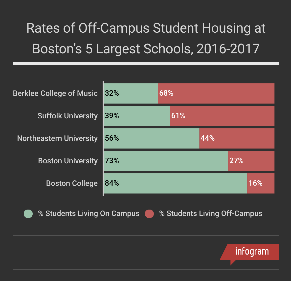
More often than not, you’ll need multiple visualizations to tell a complete story. We looked to our second question (For the five colleges with the largest student populations in Boston: how many full-time undergraduate students live off-campus?) for our complementary charts.
Step 1
To create college comparison charts, we used Infogram. Click on “Get Started” to sign up for an account. For now, create a “Basic” account, which is free. If you end up enjoying using Infogram, you can upgrade to different plans.
Before importing, make sure you’ve sorted your sheet by Column C (“Percent of Students Not Provided Housing”) from largest to smallest. To do that, highlight Column C, click on “Data,” and select “Sort sheet by Column C from Z → A.”
Step 2
Import your data by clicking on the “Data import or source” button. You will be able to upload your excel sheet or Google spreadsheet with ease. Give your project a name like “Student Housing.” Infogram will immediately turn your data into a Line Graph visualization and sort your data according to how you sorted in the spreadsheet. The line graph is not ideal for this visualization. To change it, simply click on the chart. You’ll find “Chart type” on the right sidebar. You’ll find a list of different charts you can use in that list. We used the “Stacked” chart option.
Step 3
To make your visualization more user-friendly, click on “Chart properties” in the Settings tab and select “Show values.” You will notice that the percentages for each school will show up inside the bars, making the chart easier to read and understand. With percentages inside each bar, the grid and numbers (or labels) on the X-axis are unnecessary. To make your visualization look cleaner, click on “Axis & grid”, click on “Grid,” and select “None.” Then scroll down to “Axis labels” and select “Show on y only”.
Step 4
Make sure your Legend is available and clear to help the users understand what they’re looking at. Scroll down to “Legend” and turn it on. You can also edit the Legend by editing it in your imported data directly.
If you’re feeling a little extra creative, click on the Infogram you created (anywhere below or above the chart). You’ll instantly be directed to “Project settings” where you can change the theme of your visualization. Here you can select different color and font combinations. We selected the “Tokyo” theme. Colors can be edited in the Settings.
Step 5
Don’t forget to give your visualization a title! On the left sidebar, you’ll find an “Add text” option (Aa). Click on it and drag “Title” to your visualization and insert it on the top. A good title is clear and specific to your data. Make sure you include information that is relevant to your story. Since our story focuses on students who were not provided housing, a good title might be “Students Without Housing Provided at Boston’s 5 Largest Schools, 2016-2017”. Make sure you include that only full-time undergraduate students were used for this study in your description or text.
Once you’re done, click on the “Download” button and download your visualization as a JPG or PNG file. Make sure the “Show label values” button is checked.