
By Dave DeCamp
On November 4, 2015, the NULab for Texts, Maps, and Networks and Digital Scholarship Group hosted Lauren Klein for a fascinating talk titled, “Feminist Data Visualization: Rethinking the Archive, Reshaping the Field.” An Assistant Professor at the School of Literature, Media, and Communication at the Georgia Institute of Technology, Klein is currently the associate series editor for the annual edition of Debates in Digital Humanities with Matthew Gold. Her talk served as a preliminary examination of her current monograph project, which considers the history of data visualization from the eighteenth century to the present. In this project, she investigates the cultural and critical dimensions of data visualization, theorizes the function of data visualization for historical scholarship, and explores the practice of creating and interpreting data visualizations.
Klein’s talk focused on a provocative question: What alternative histories emerge when we rethink the archive of data visualization? In particular, Klein analyzed the work of three nineteenth-century female “data visualizers” (Emma Hart Willard, Almira Hart Lincoln Phelps, and Elizabeth Palmer Peabody) and compared it to William Playfair’s authoritative approach to data visualization. Playfair’s work on data visualization, and the ways in which he approached the visual display of quantitative data, has shaped the field of data visualization and has had quite an influence on the ways in which digital humanists and social scientists approach data visualizations, and create digital platforms for making these visualizations, today. Playfair’s clear, informative, and easy-to-understand visualizations, which place an emphasis on conveying an argument (or serving as evidence for a larger argument), have served as a standard for Digital Humanists creating and using data visualizations in their work.
Consider, for example, Edward Tufte’s influential guides to creating informative data visualizations in The Visual Display of Quantitative Information (1983) and Envisioning Information (1990). In both works, Tufte warns readers against employing excessive decoration to data visualizations since they obscure the data, the information displayed, and one’s overall argument. Tufte persistently rails against the use of “chartjunk,” defined as the useless, non-informative, or obscuring elements (typically decorative) of visualizations; instead he stresses the need for those creating data visualizations to consider the ‘data-to-ink’ ratio of their graphics.
Klein’s analysis of Willard, Phelps, and Peabody’s data visualizations, however, challenge the normative standards for ‘proper’ data visualizations established by Playfair and reinforced by Tufte. Instead of focusing only on the legibility of visualizations for data, argument, or evidence, Klein considers alternative means for creating, employing, and interpreting data visualizations. Willard, Phelps, and Peabody’s work in many ways would be considered ‘failures’ is visualization. But Klein uses this as an opportunity to ask why these are considered failures, what can we actually learn from them, how can we use them, and how can we perceive them as pathways to alternative futures in data visualization. All data visualizations are concerned with knowledge production, but these ‘failures’ in design were much more concerned with the individual and communal acts of interpreting data visualizations rather than attempting to present their data in the clearest and most self-evident way. This emphasis on engagement with and interpretation of the visualizations opens up more ways for users, students, and other individuals to create new narratives and interpretations for themselves, rather than having “the data speak for itself.”
For example, Klein analyzes Elizabeth Palmer Peabody’s grid visualization from her A Chronological History of the United States (1856):
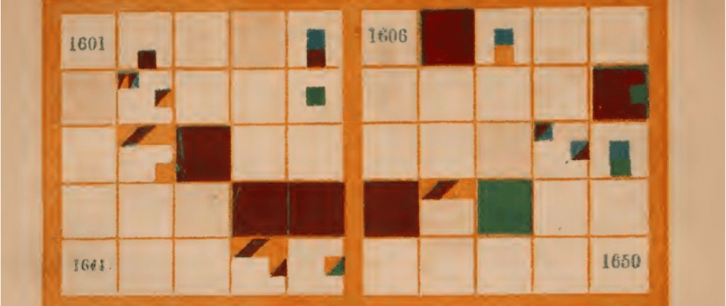
Peabody’s visualization attempts to create a color-coded and grid-based timeline of historical events, but to a modern reader, it may appear impenetrable. We see some data on the years, which are divided into grids. One sees empty space all over the visualization and it is hard to consider what the different patches of color mean. According to Tuftian standards of data visualization, this image is filled with chartjunk, does not have a clear argument, and its data-to-ink ratio is unacceptable.
But, as Klein reveals, Peabody had very different views on the purpose and use of data visualizations. Peabody was a teacher, educator, and bookstore owner. She placed a heavy emphasis on the role of data visualizations: not as support for a given argument, but instead as a valuable teaching exercise in which students or viewers would be forced to create their own interpretations and narratives, both while creating such a visualization and while trying to read it. To Peabody, uncertainty was the purpose of creating this visualization, which required a completely different mode of sensory engagement with the material. By requiring viewers to directly engage with the visualization in order to construct their own narratives of history, individuals could produce historical knowledge for themselves.
Emma Willard’s Temple of Time (1846) similarly eschews clarity for decoration and uncertainty, stresses the agency of the viewer in the creation of historical knowledge, and foregrounds the value of data visualizations as an interpretive exercise rather than an argumentative or evidentiary tool:
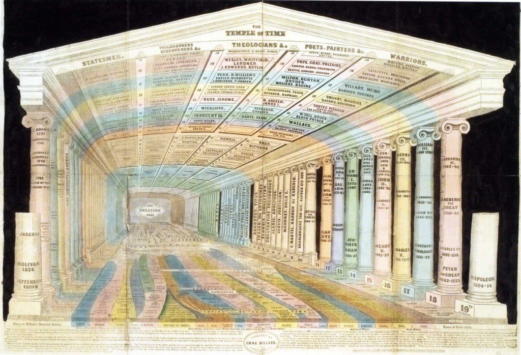
This visualization displays a decorative timeline of history where each column represents one century. Through use of perspective, the columns literally recede into the past and the information becomes harder and harder to decipher. On the ceiling, Willard notes the famous “statesmen”, “philosophers and discoverers”, “theologians”, “painters”, and “warriors” for each century. The columns are decorated with the names of monarchs and state leaders, and the floors serves as a decorated timeline of major historical events color-coded by nation, empire, or civilization. The 19th-century column is half-finished, and when paired with Willard’s choices on perspective, this displays history as unfinished–a work in progress–and places the burden of responsibility on the viewer to shape historical knowledge. To Willard, the act of giving visual form to information required interpretation and transformation.
While one can certainly criticize the effectiveness of these visualizations, Klein’s talk makes the important argument that we must consider alternative ways of creating and understanding data visualizations. Our current standards on data visualization are successful at presenting clear arguments, at providing evidence for historical or literary interpretations, and at providing a sanitized container for the display of quantitative data. Visualizations like Peabody and Willard’s, however, prioritize uncertainty and individual agency in the act of knowledge production rather than the authoritative voice of the data visualizer. Exploring these alternative modes of display and interpretation can open new ways of designing data visualizations and inform new digital platforms for creating visualizations.
For more on Klein’s current projects, research, and teaching, visit her website: http://lklein.com/.


