
By Laura Johnson
Programming for the NULab’s theme of Digital Storytelling kicked off with an interdisciplinary panel, “What’s the Story?”, featuring Northeastern faculty members who discussed how they each engage with digital storytelling and narrative, raising questions about methodology, data, media, theory, and visualizations. This event was co-sponsored by the Northeastern University Visualization Consortium (NUVis). Elizabeth Maddock Dillon, the panel moderator, opened this event with several critical questions about disciplinary divisions, literature as data, and the use of storytelling in STEM fields, asking: what is at stake in crossing these disciplinary lines? What do different disciplines bring to each other as ways of knowing? Throughout the panelists’ presentations and the discussion that followed, a clear theme of storytelling across disciplines emerged.
Michelle Borkin, Assistant Professor, College of Computer and Information Science
In her presentation titled “Visual data-driven storytelling,” Michelle Borkin explored the digital project, “Rediscovering the Refugee Scholars of the Nazi Era”. For this project, a group of scholars examined archived materials of the Emergency Committee in Aid of Displaced Foreign Scholars (a private group that funded a number of European scholars to flee to the US) at the New York Public Library. They focused on gathering and recording the stories and work of the women scientists who applied for aid from the Emergency Committee. In thinking about how to preserve these lost and forgotten stories, Borkin presented some of the largest challenges of this process: how to construct data around these stories and how to visualize this data?
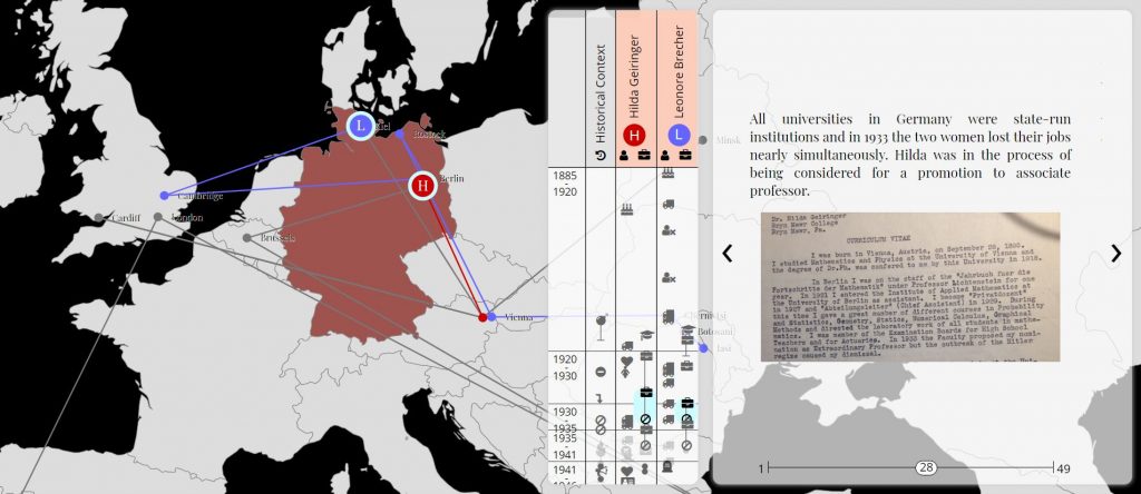
To demonstrate the difficulty and scope of this process, Borkin presented the final version of the project’s visualization tracing the journey and stories of two female scholars, Leonore Brecher and Hilda Gieringer. This visualization pairs mapping with narrative and, as Borkin pointed out, was built from scratch to accommodate the unique features of their data including geographical locations, photos, and academic scholarship. The future of this project, Borkin explained, was about expanding the scope of their focus to study male and female scholars from different specific disciplines—like chemistry—and turning their visualization and data into a publicly accessible tool. In the end, Borkin noted that this project forced her to think about storytelling in a new way beyond more traditional mediums or processes of publishing and visual storytelling to how narrative is underexplored in science communication.
Pedro Cruz, Assistant Professor of Art + Design, College of Arts, Media, and Design
In his presentation, “Data-driven generative storytelling,” Pedro Cruz explored several of his projects as a visualization designer, highlighting how the “Process is the Project” when it comes to his work in digital storytelling, which often involves algorithms that incorporate randomness or chance as variables. In his discussion about data and creating visualizations, Cruz explained that every time a simulation of data is run, it is slightly different or, “the same story, but with slightly different flavor.” Part of the challenge, he notes, is making the system of a data stream or data set a bigger part of the storytelling process. Cruz explained that data is a series of events enacted by actors or reacted to by actors. The designer, then, determines how to frame these events to tell a particular story.
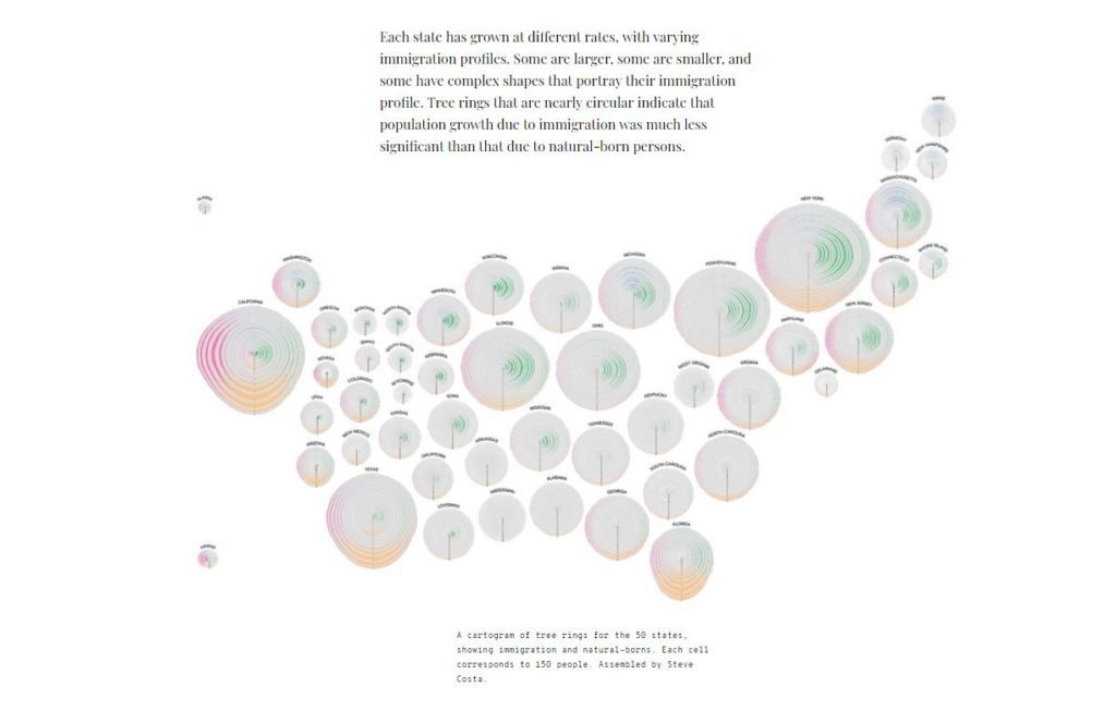
To highlight the complexity of this process, Cruz explored the different iterations of his project, “Simulated Dendrochronology of US Immigration” (with Prof. John Wihbey), in which he used the U.S. Census data from 1830 to 2015 to construct a representation of immigration in the U.S. (The project was featured in National Geographic and won two major international awards in the 2018 Kantar Information Is Beautiful competition.) In attempting to represent the granularity of the data, he adopted the metaphor of a forest, ultimately using the cross-section of a tree with cells growing in each direction as a model. This process, as Cruz noted, had several limitations, requiring him to ask: what did he want to prioritize in his visualization and what story did he want to tell? For the final version of this project, Cruz generated fifty visualizations for each state (currently displayed in West Village H on Northeastern’s campus). Cruz ended with another question for future consideration: where could this project go in relation to indigenous populations across the United States?
John Wihbey, Assistant Professor of Journalism and Media Innovation, College of Arts, Media, and Design
John Wihbey spoke about the circulation of data visualizations in his presentation, “Data storytelling for impact.” Discussing the difficulty (and importance) in creating alternative narratives with data, he posed a fundamental question: how do we get data into the wider world? Wihbey explored this question through his involvement with a variety of digital storytelling projects including the Rediscovering the Refugee Scholars of the Nazi Era project with Michelle Borkin and Laurel Leff. Last year when a contributing writer wrote an article about the Rediscovering Refugee Scholars project for the Smithsonian, Wihbey noted that the project was able to get coverage and reach a broader audience. While publicity provides additional opportunities for public engagement and feedback for digital projects, that the circulation of data is also a primary site of investigation for several projects.
For example, Wihbey next explored The State of Financial Disclosure Project, a project (with NU Profs. Mike and Beaudet and Pedro Cruz) investigating and visualizing public disclosure laws for elected officials by state in the US. As an effort to tell a story about government transparency and corruption with the inconsistencies of these laws, Wihbey noted the challenges of visualizing this project — particularly the need to strike a balance between making the data visually compelling and displaying corruption and levels of transparency in a clear and effective way. This project was showcased in an article on the Monkey Cage blog for the Washington Post and generated many public discussions. In drawing on this example, Wihbey points to the design concerns of using data for storytelling for the media and the public: how can we include whimsy in our designs and go beyond a “data dump”? Wihbey ended his presentation by acknowledging a need to create more accessible and interactive data in future storytelling endeavors.
Elizabeth Maddock Dillon, Chair and Professor of English; Co-Director of the NULab for Texts, Maps, and Networks
Taking a step back from the discussion of how to tell a compelling story, Elizabeth Maddock Dillon instead asked: “what is a story?” In her presentation, “Narrative Theory,” Dillon outlined the importance of sequence, motivation, and cause in compelling stories through the history of narrative theory. Starting with Structuralism and Vladimir Propp’s typology of 31 abstract units of plot, Dillon notes early forms of narrative theory were defined by classifying and taxonomizing narrative. Later theorists of this “new science” like Roland Barthes and Gerard Genette worked with the classification of narrative ideas and rhetorics of composition. This form of narrative theory shifted as post-structuralism emerged, moving towards an emphasis on the multiplicity of meaning and away from comprehensive structural forms.
In providing this theoretical history, Dillon noted that digital humanities have resulted in a return to early techniques of narrative theory through efforts to taxonomize narratives with digital tools. Citing Matthew Jocker’s work in using sentimental and plot analysis in R to model 6 plot archetypes in narrative, Dillon notes that, while this project has received a lot of debate surrounding the “smoothing” of data, the interesting part of the conversation is not about typology but the way that narrative often takes “a well-worn path.” This, Dillon notes, is how narrative often brings pleasure because of familiar narrative structures and that, consequently, narrative is a sense-making instrument that operates at the intersection of convention and causality. Dillon ended her talk in thinking about the future of narrative theory and encouraged further consideration of responsible engagements with storytelling.
Élika Ortega, Assistant Professor, Cultures, Societies, and Global Studies
Élika Ortega closed the panelist presentations with her talk, “Digital literature and media shifts.” Ortega began her talk by discussing two important problems of approaching literature as data in literary studies: scope/size and textual form. To explore the relationship between these two features of text and literature as data, Ortega presented a number of works of electronic literature and interactive media from clickable poems, twitter-generated stories, VR-interactive texts, and texts with supplemental media on floppy disks and DVDs.

For example, This is a Picture of Wind by J.R. Carpenter is a Twitter-based remix of short texts written by the author, where a text generator is used to respond to information with new fragments of the original text. Between Page and Screen by Amanda Borsuk and Brad Bouse is about screen-facilitated reading portrayed through imagined conversations between the personified figures of page and screen. These conversations are captured in geometric shapes printed on blank pages that require a screen and webcam to read in full. Ortega then explored a number of print-digital literary works, noting that her research has yielded a list of over fifty texts that utilize technology in a complementary manner to print. In this project, Ortega traces the development of storage media and the interaction of storytelling ability for narrative, thinking about and why some forms of narrative are “annoyingly” stable while others are increasingly outdated. Ortega ended her presentation with an observation of how technology shapes and mediates language, arguing that the rapid change and growth of technology demands different types of reading and narrative.


