Simulated Dendrochronology
of U.S. Immigration
1790-2016
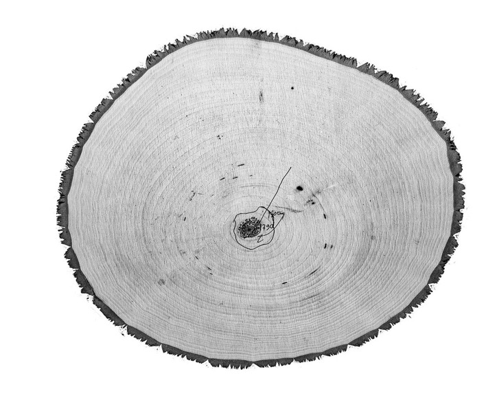
Nature has its own ways of organizing information: organisms grow and register information from the environment. This is particularly notable in trees, which, through their rings, tell the story of their growth. Drawing on this phenomenon as a visual metaphor, the United States can be envisioned as a tree, with shapes and growing patterns influenced by immigration. The nation, the tree, is hundreds of years old, and its cells are made out of immigrants. As time passes, the cells are deposited in decennial rings that capture waves of immigration.
A tree for U.S. immigration

Tree rings showing immigration for 1830-2016.
Each dot corresponds to 100 immigrants.
Cells grow more in specific directions depending on the geographic origin of the immigrants. Rings that are more skewed toward the country’s East, for example, show more immigration from Europe, while rings skewed South show more immigration from Latin America.

A cell represents a specific number of immigrants who arrived in a given decade. A computational algorithm deposits those cells in such a way that simulates the appearance of tree rings. This physics-based system generates a data visualization that is based on millions of data points. The data was queried from IPUMS-USA and consists of millions of samples of questionnaires from U.S. Censuses.

Close-up on the dashes that represent the simulated cells.
The historical formation process of this tree can be observed in an animated way. Here, the granularity of the dataset is unveiled as hundreds of points of origin are laid out.
A forest of trees
The U.S. and its population growth can also be envisioned as a forest of trees. Tree sections, one for each state in the U.S., show the growth profile due to incoming immigration, but also due to newborns (here referred to as natural-borns).

Each state has grown at different rates, with varying immigration profiles. Some are larger, some are smaller, and some have complex shapes that portray their immigration profile. Tree rings that are nearly circular indicate that population growth due to immigration was much less significant than that due to natural-born persons.

A cartogram of tree rings for the 50 states, showing immigration and natural-borns. Each cell corresponds to 150 people. Assembled by Steve Costa.

Immigration and natural-borns in the state of Massachusetts (1790-2016), 30x30 in.
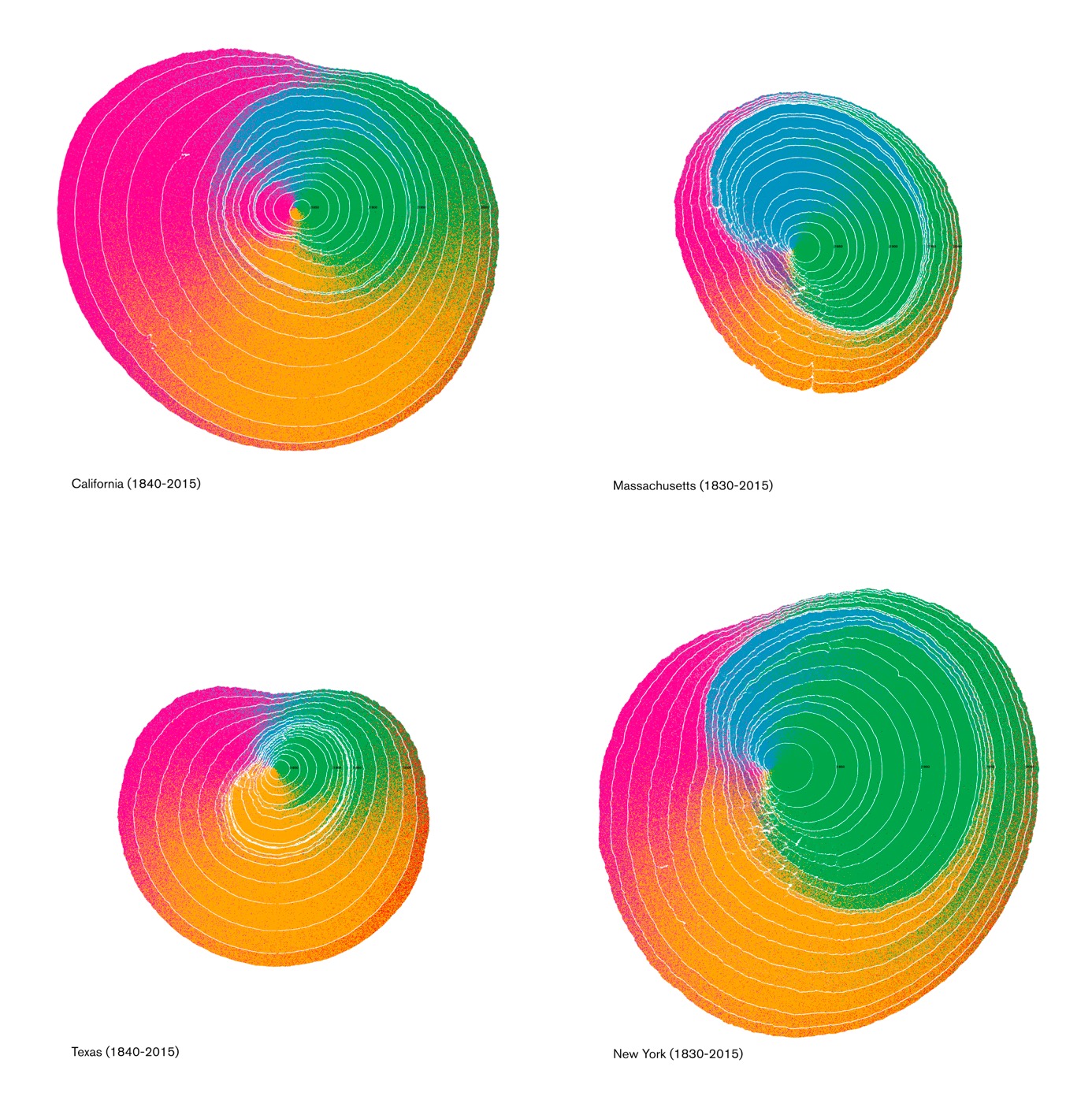
Tree rings for four states, showing immigration only.
More information
This is an ongoing project by Pedro Cruz, John Wihbey, Avni Ghael, and Felipe Shibuya. This project was kindly supported by the College of Arts, Media, and Design at Northeastern University (as part of the Dean’s Research Fellows 2017-2018, which included Sarah J. Jackson and Brooke Foucault Welles, and Population Flows and Identity in the U.S., and Waves of Immigrants research grants projects). Exhibition of the tree rings kindly supported by the Northeastern Center for the Arts.
We would also like to thank the Maps & Graphics department at National Geographic for beautifully featuring one of the tree trunks and working with us on this story. More can be read on the design process behind this visualization in this paper published in the annotated projects of the IEEE VIS Arts Program.