Mobility Patterns of Boston Workers
Visualizing Origin to Destination Flows
The Origin-Destination(O-D) pattern is a fundamental concept in transportation. It summarizes people and vehicle movements across geographical regions. Visualizing Boston employees’ home and work flow is one way to understand Boston commuters’ mobility patterns.
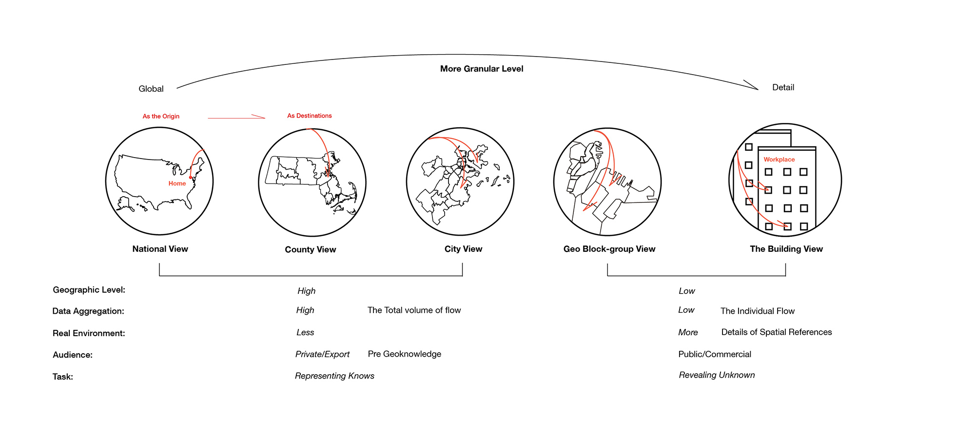
However, visualizing Origin-Destination (O-D) flow is always a challenge, in terms of the visual clarity for representing multi-dimensional data in a single plot. This thesis explores design approaches for Origin-Destination (O-D) flow, in order to efficiently encode and communicate this spatial data. A 3D tree-node diagram analyzed the Boston workers flow in various spatial granularities, as one method been discussed throughout this exhibition.
The Mobility Pattern
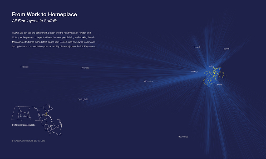
Boston is the capital city of Massachusetts and the region's central hub, located in Suffolk County. The flow map to the right describes the overall mobility pattern of all employees in Suffolk. It shows the highest concentration of employment were Boston and the nearby towns, as the hotspot area in Massachusetts.
This visualization only can show the overall pattern and give a sense of the total volume of flows. But it has so many visual clusters of flows, lost is the individual trip view and the passthrough of the flow. One solution is that with a more granular mapping, it represents the flow variation in different, multi-dimensional geographic levels and more spatial references to reality.
A Physical Map Visualization
How to map 1 million flows from work to home in Suffolk?
This physical visualization maps the mobility pattern of all Boston employees, working and home distribution in different layers. It discusses a visualization approach for the Origin to Destination data – mapping with a 3D tree-node diagram, which has a similar function to the Sankey Arcs diagram. The line connects the origin and destinations, also the flow evolution changes across different geographic regions.
It intends to frame the concept that mapping with more granularities, the multi-dimensional flow could be revealed with more layers and patterns. Also, the more granular geographic features can connect to people's perception of place in reality, to understand the abstract data.
.jpg)
Swipe or Click and Drag to Rotate
Drag to see flows of all workers from home to workplace distribution. The red thread connects workplaces and homeplaces. The circle size index the volume of the flow.
The front view shows the overall map where all Suffolk employees lived in Massachusetts' county. Following the red thread through each layer, you can see Boston employees' workplace distributed in different neighborhoods and geo block-groups. The rearview shows the path of an individual flow: the most concentrated work block-group is in Downtown and where those people lived in Boston.
The Map Layers
Seeing through these map layers, the flow patterns reveal the phenomena behind the number of 1 million workers. Boston has the most concentration of employees in Suffolk County. The densest of all working areas in Boston is Downtown. Within Downtown, the busiest hotspot is the large corporate offices and high building there.
This physical visualization consists of six map layers. Layers were laser cut on clear acrylic panels. Then threaded the line and installed them at home during the COVID-19 period. This data visualization piece involves a craft-making process. It contains some aesthetics and human experiences on making and materials, also experiencing the data, which can’t be replaced by the digital version.
As the Origin: 1,050,246 Suffolk employees living in Massachusetts
As Destinations: Where they worked in Suffolk

The red thread indexes the Origin to Destination flow

The First Layer — As Origins
Massachusetts Map with Counties
Most Employees live in Essex, Middlesex, Suffolk, Norfolk, Bristol and Plymouth.
The circle size indexes the volume of the flow

The Second Layer — The total volume of the flow
1,050,246
The total number of Employees in Suffolk County

The Third Layer — As Destinations
Suffolk County Map with Towns
Most employees worked in Boston than in Chelsea, Winthrop, and Revere.
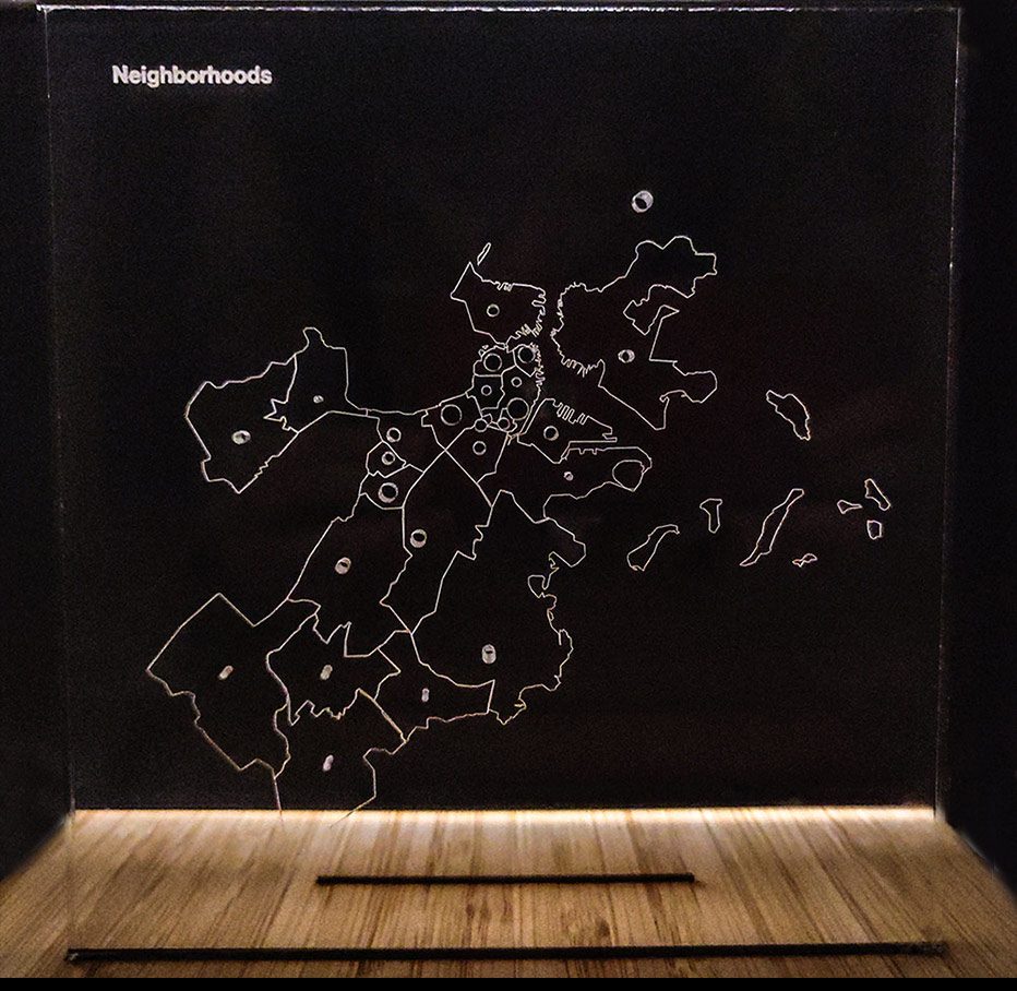
The Fourth Layer — As Destinations
Boston City Map with Neighborhoods
Employees' workplace distributed to the 23 neighborhoods of Boston. Majority worked in Downtown, Chinatown, Leather District, Seaport, South End, Back Bay, Longwood.
The Fifth Layer — As Destinations and an Origin
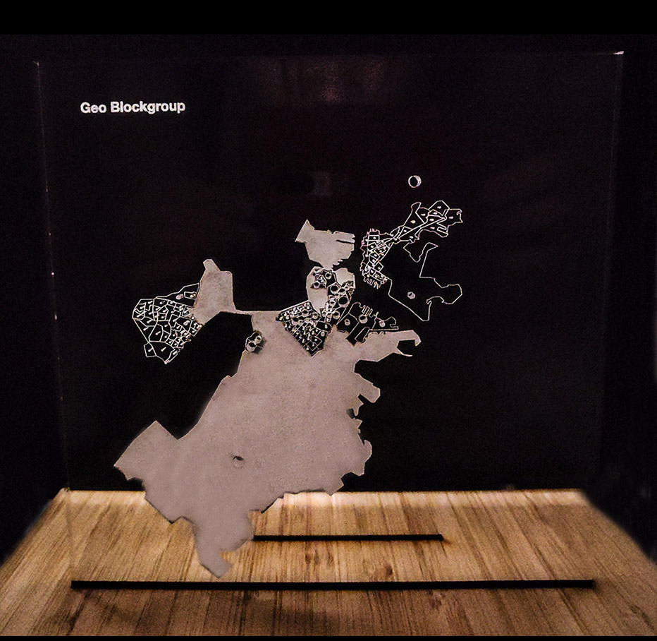
Boston City Map with Geo Block-Groups
Most concentrated work neighborhoods distributed into their geo block-group. Among all of them, the densest work block-group was located in Downtown, which is the biggest circle in this map layer. It is the work block-group 250250702025.
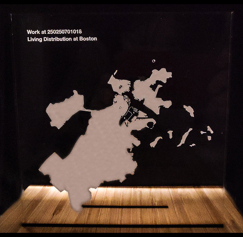
The Sixth Layer — The Individual flow, as Destinations
Boston City Map with Downtown Block-Group
In real environment, The 250250702025 block-group is between Summer Street, Purchase Street, and High Street, where all the tall buildings and big companies located. Companies such as, State Street, Goldman Sachs, and Cambridge Associates. As destinations from that work block-group, what does the employees' home distribution look like in Boston? In this map layer, it shows many of them were living nearby downtown neighborhoods.
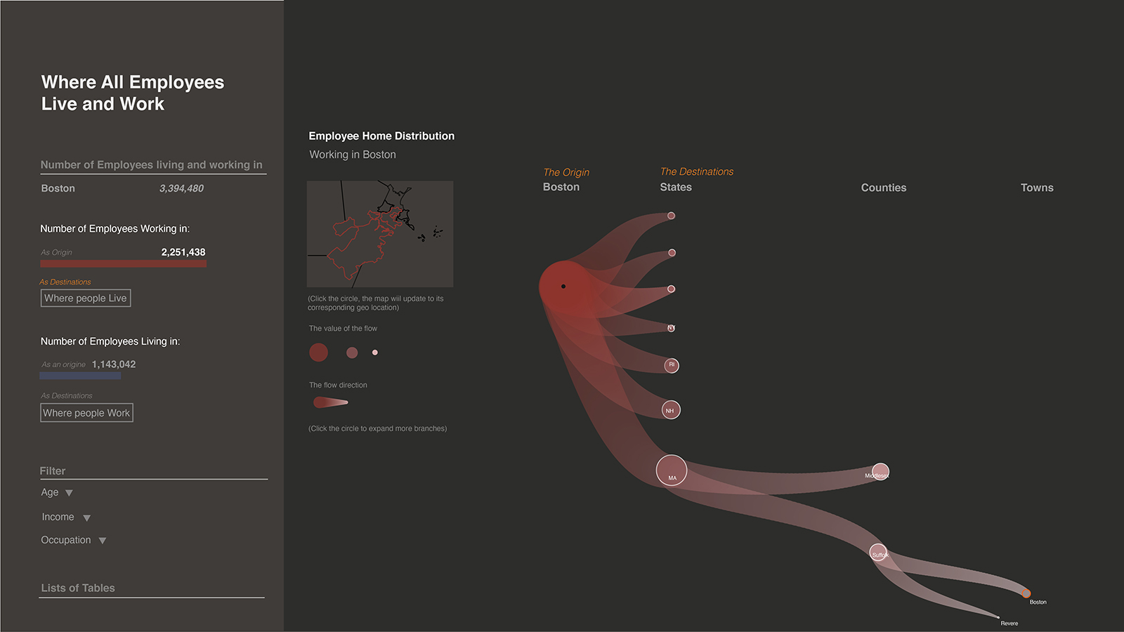
A Web Application
Mapping with more granularity, and the 3D three-node diagram approaches will be implemented to an interactive web application, to visualize the flow pattern of all Boston Employee's work to home. Although, this web application discusses other visualization approaches for Origin-Destination (O-D) flow.
The choropleth map describes the workplace distribution in Boston at the geo block-group level while the color saturation changes index the volume of flow. When the user clicks the button "Where People Live" in the right-side search panel, the interface will update to the tree node diagram.
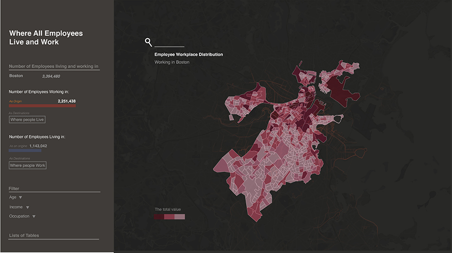
It draws the pattern of homeplace distribution at each geographic level, from states to counties, to towns, and finally geo block-groups. Also, each tree-node can expand and correspond to its geographic location in the map window, when the user mouse clicks on it.
The design for mapping this tree-node diagram to a web version will continue developing, and discussing other visualization approaches in the next step.