Visualizing Group Therapy
Designing a Tool to Visualize Conversations and Improve Therapist Skills
Can data visualization help group therapists provide better therapy? In recent years, data collection has become integral to the personal and professional lives of millions around the world. Yet despite the increase in available technology and data, the process of training and supervising group psychotherapists has scarcely changed in fifty years.
Medical charts and visualizations have historically focused on quantitative data. This thesis explores an intriguing new possibility for data visualization in mental health care: using transcript data to visualize conversations in group therapy sessions, and ultimately use these insights to help therapists and supervisors provide better care.

Why visualize group therapy?
Group therapy is popular for many reasons. Unlike individual therapy, groups allow counselors to work with multiple clients in a short period of time. Group therapy is used for many situations, from substance abuse recovery to mindfulness meditation. At an emotional level, groups provide members with a sense of community that is impossible to develop in individual therapy. By sharing and listening, group members feel a sense of “universality”, the knowledge that they are not alone in their experiences. Irvin Yalom, a pioneer of group therapy, noticed that groups also function as a "social microcosm". In group therapy, clients exhibit the same interpersonal behaviors that they do in their outside interactions, allowing therapists and other group members to comment on unhealthy interactions and practice new, healthier behaviors.
However, group therapy can be unhelpful or even dangerous in the hands of unskilled or poorly trained psychologists. How, then, can we train better group therapists?
This thesis introduces prototypes for a visualization tool to help therapists and their supervisors explore patterns, conversation topics, and dynamics in group therapy. The tool will use data from automated session transcripts and allow users to search conversations, view outcome trends for individuals and groups, and visualize group dynamics over time.
Design Process
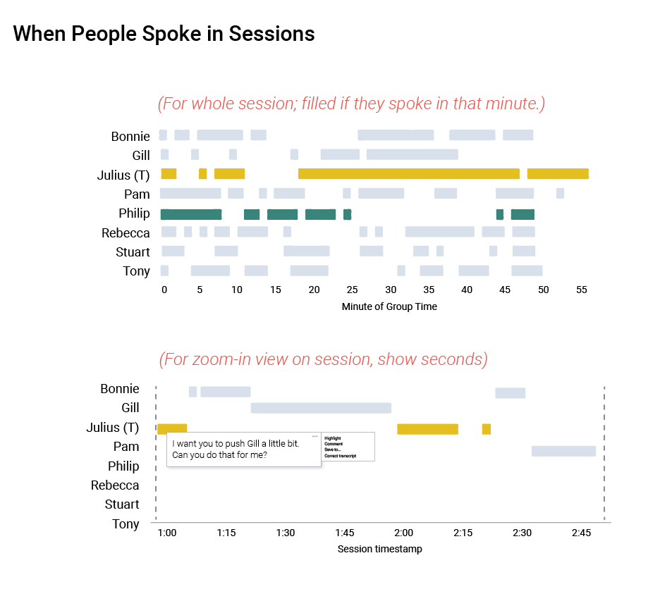
Gathering information through a literature review and interviews with four group therapists, I learned that the most important variables to visualize in a group session were talk times, speaker segmentation, directionality of comment, and content of the utterance.
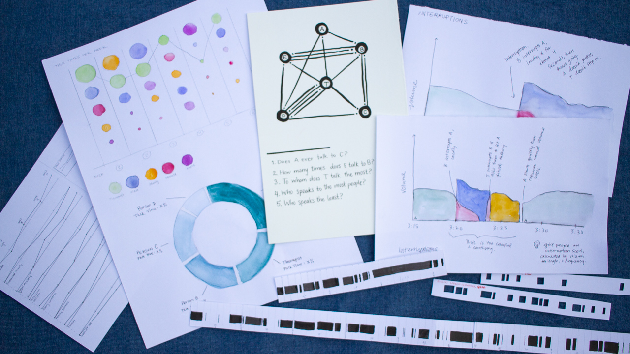
I am a tactile person, so my first designs were physical prototypes exploring ways to visualize talk times. I wanted to find ways to visualize who spoke, how long they talked for, and when they tended to participate in the session.


Next I hand-coded data from a sixty-minute group therapy demonstration (via psychotherapy.net) to gather realistic session data. The data included speakers, length of comment, vocal arousal, and recipient of comment. With this data, I began to prototype digitally using Tableau and Illustrator.
A note on the data: The supervisors I interviewed also indicated that they would be interested in a visualized “report card” of therapist skills. These skills include empathy, appropriate self-disclosure, and specific therapeutic interventions. In the interest of time, my first push for prototypes focused exclusively on visualizing session dynamics. However, when I coded the full session demonstration, I coded various therapist skills as well, for use in future prototypes.
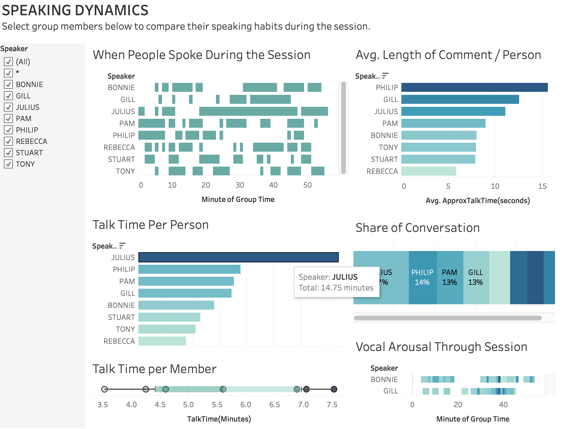
Chart Literacy and Session Visualization
An interesting challenge of this project is that very little design work has been dedicated to visualizing group conversations. Most college-educated individuals are comfortable reading scatterplots, bar charts, and line graphs. But to effectively convey information about session dynamics, a designer may have to push readers to navigate less familiar chart types.
I had originally planned to approach therapists with a mockups of a session visualization dashboard in a realistic-looking product. However, the “chart literacy” hurdle lead me to consider a different approach. Now, my first step in evaluation will be testing different types of visualization to see what professional therapists find readable and useful. Only then will I know what kinds of chart will be most effective, and should be included in the product.

Next Steps
While the progress so far has been exciting, the design experiments from this project still need to be polished, then evaluated by professional therapists. The next steps for this research are as follows:
- From many options, narrow down the chart forms to have therapists compare and evaluate.
- Conduct focus groups with practicing group therapists and supervisors to determine if these designs are understandable, interesting, and likely to be used.
- Incorporate therapist feedback into final prototypes to present to my thesis committee and the design community.